Raising Awareness with Data-Rich Designs
I love thinking of ways to make data-rich materials accessible and engaging. As a designer for both AIDS Action Committee and Fenway Health, I worked on many infographics to raise awareness about HIV/AIDS, hepatitis C, PrEP, and more. We shared these infographics in community newsletters, our blogs, and on social media. On occasion, the press, including Huffington Post’s“LGBT HealthLink," would reshare them as well.
In addition to designing, these projects allowed me the opportunity to leverage my writing skills, do research, and collaborate with the organizations' internal subject matter experts.
Role: Copywriting, Animation, Graphic Design
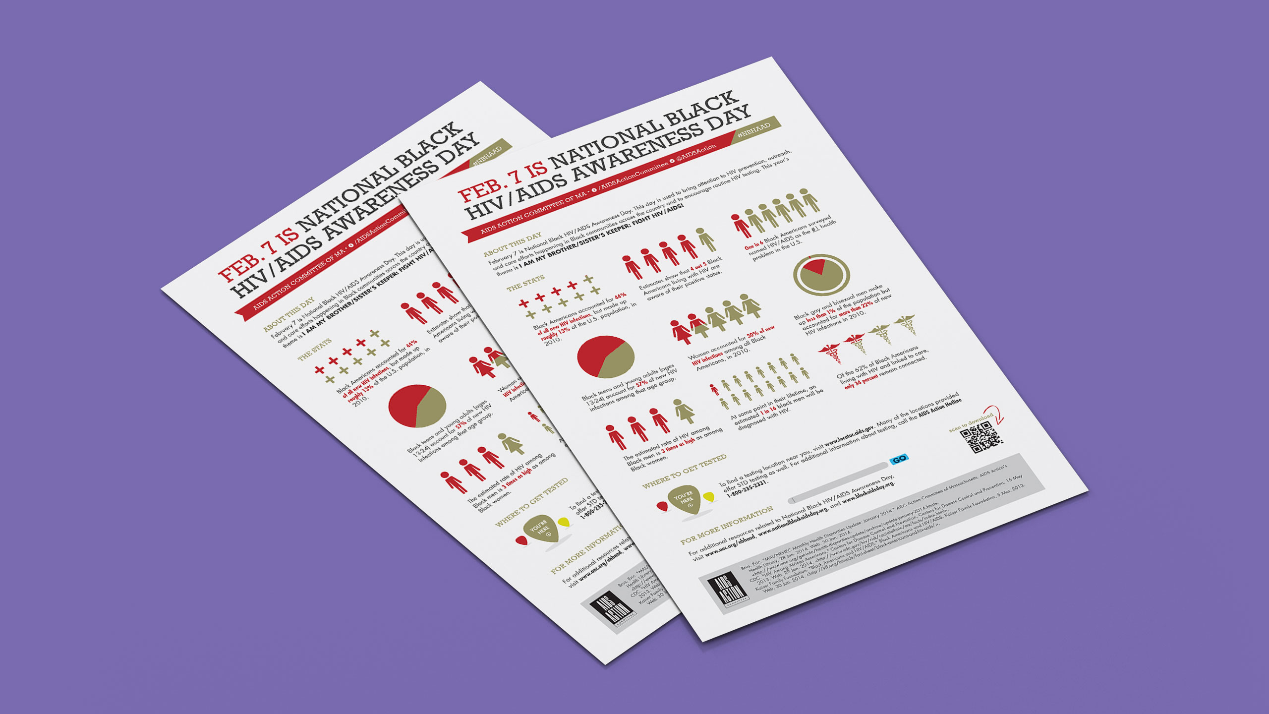
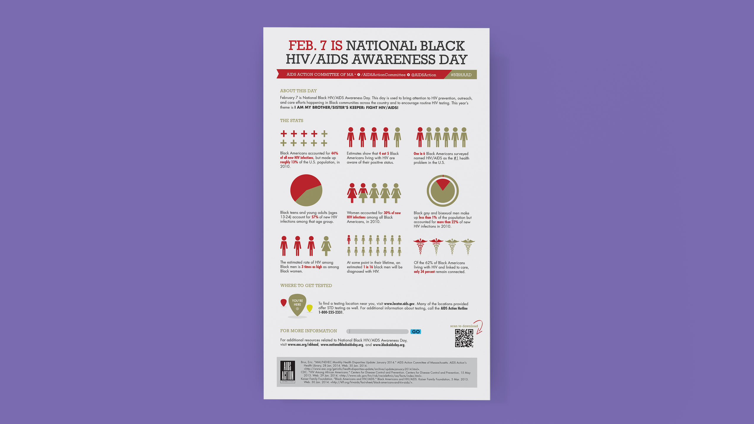
National Black HIV/AIDS Awareness Day
What I enjoy about projects like these is being able to illustrate both progress and opportunities for growth within public health.
I created an infographic in acknowledgment of National Black HIV/AIDS Awareness Day. Similar to previous data-driven design projects, I partnered with the in-house researcher to make sure the data and design told a fair and accurate story.
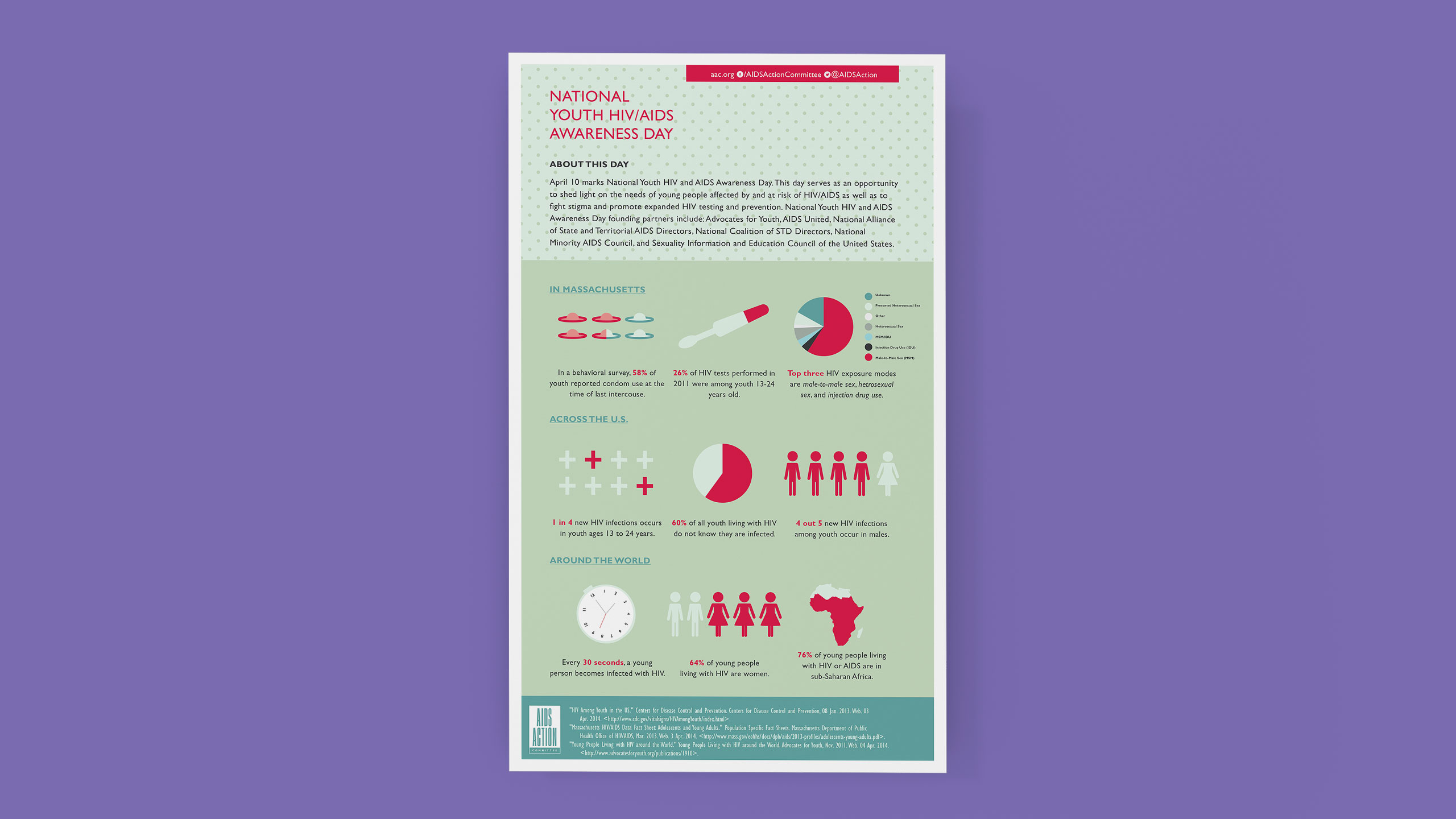
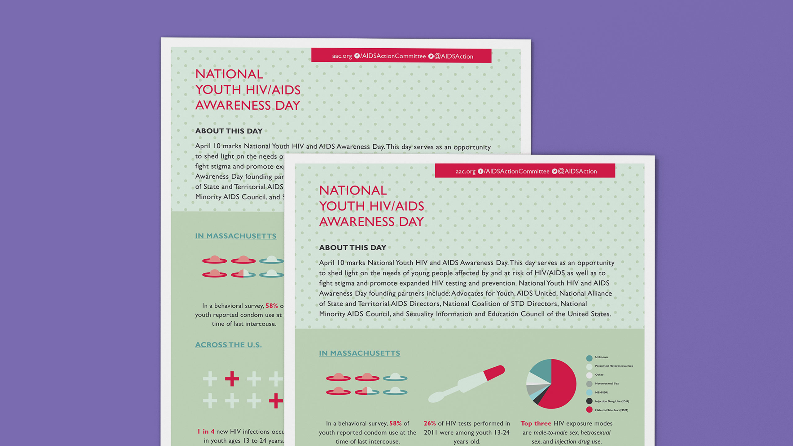
National Youth HIV/AIDS Awareness Day
As part of my role at the AIDS Action Committee, I created several infographics about how HIV/AIDS impacted underserved populations in the U.S., including youth.
As part of this project, I partnered with the team's in-house researcher to collect the data for this infographic. Then, I organized the information as well as determined and executed a visual direction for the graphic.
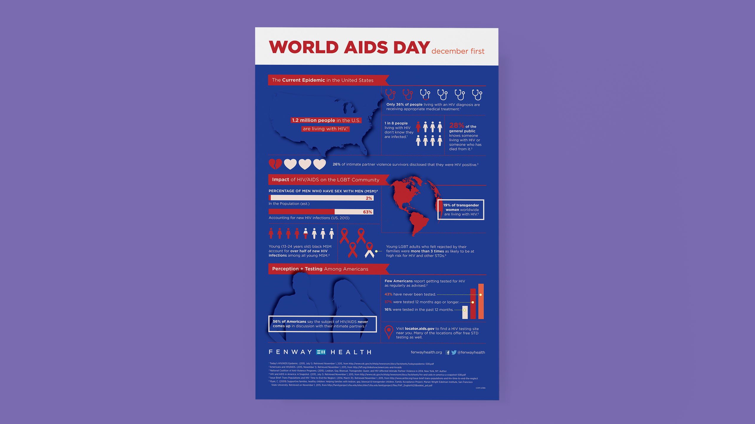
World AIDS Day
In commemoration of World AIDS Day, I designed an infographic for Fenway Health that covered how the HIV/AIDS epidemic has affected people across the globe.
As part of the process, I mapped out the story that I thought would be effective and then reviewed several internal and external research briefs to identify facts for the infographic. I was able to use colors that were from the organization's brand system and focus on typography and layout.
Selected Works

You Got Mail: Package Design for Influencer KitsProject type
Gender Justice Video ProjectVideo, Storytelling
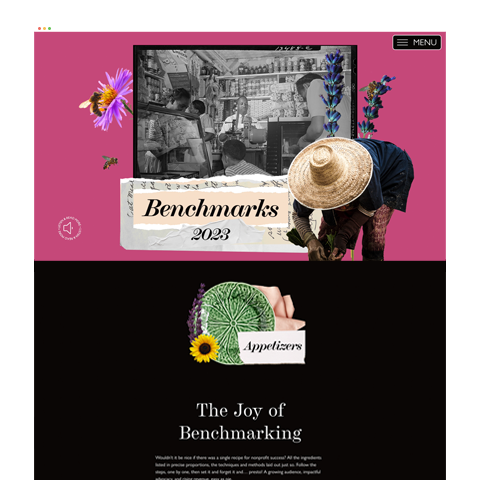
M+R Benchmarks Study 2023Project type

National Mentoring Summit 2021Storytelling, Content Development

Celebrating Live Arts Boston's First Three YearsAs a visual design consultant for the Boston Foundation, I worked with their team to produce a story-driven content hub and retrospective print report to highlight the grant's impact on advancing diversity, equity, and inclusion within the Greater Boston art scene.
Create the VoteProject type
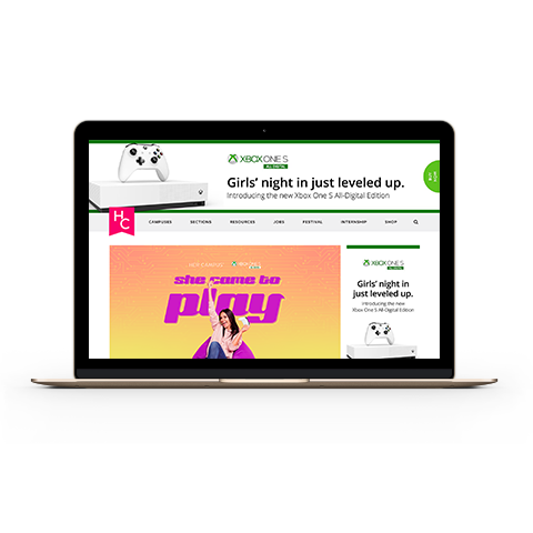
She Came to PlayProject type
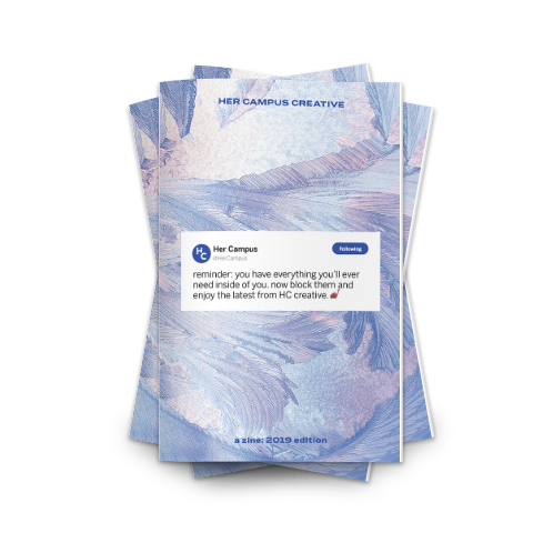
Her Campus Creative ZineProject type

Refresh Your Day TourProject type
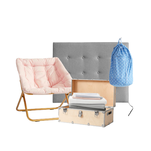
Dorm Sweet DormProject type

Youth VoteProject type

Power of Good TourProject type

Storied EatsProject type
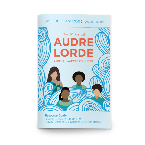
Breast Cancer AwarenessProject type

Boomerangs Thrift Store RebrandProject type

Public Policy x LGBTQ+ Health OutcomesProject type
YNPN Boston: Brand DesignProject type

Public Health InfographicsProject type