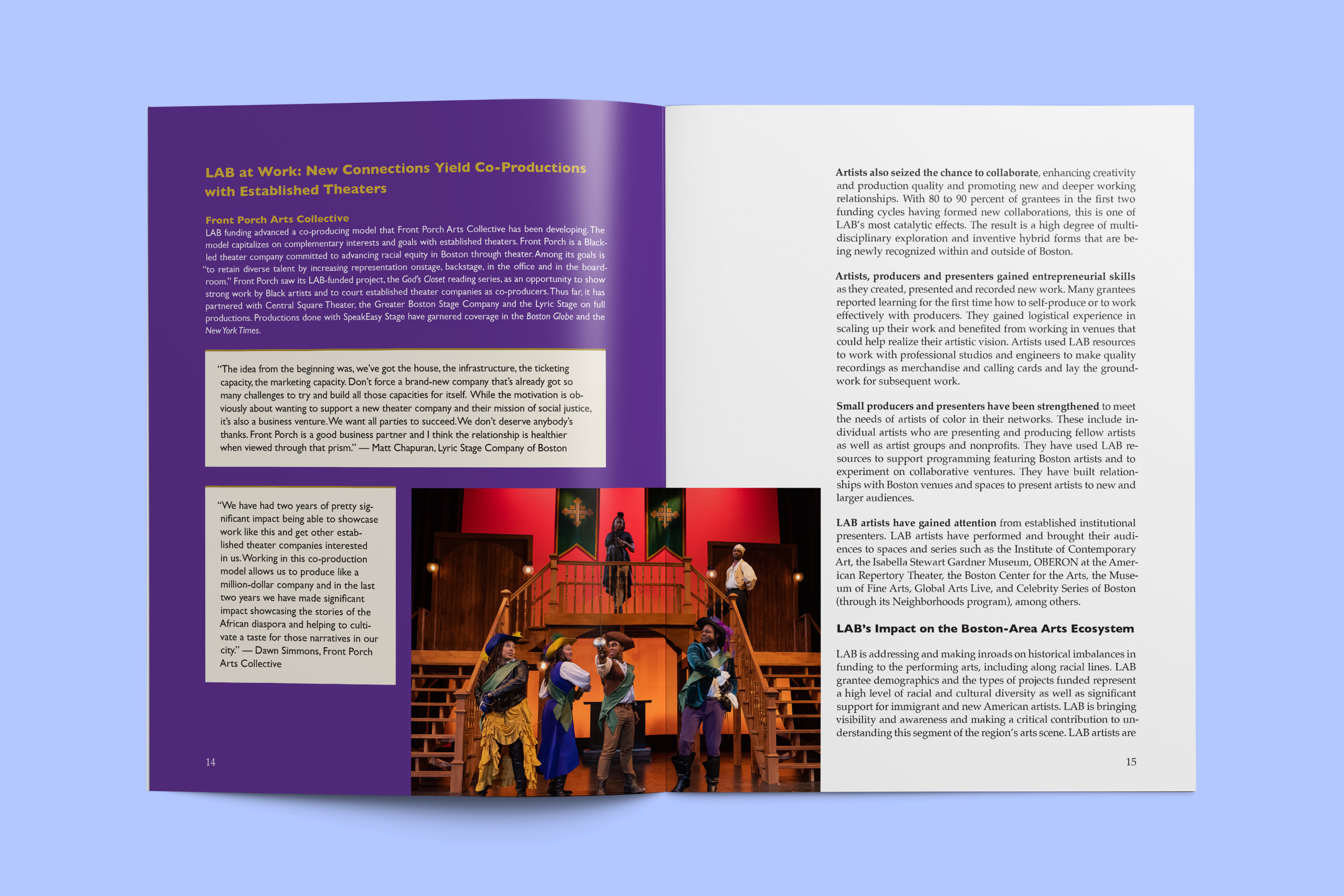
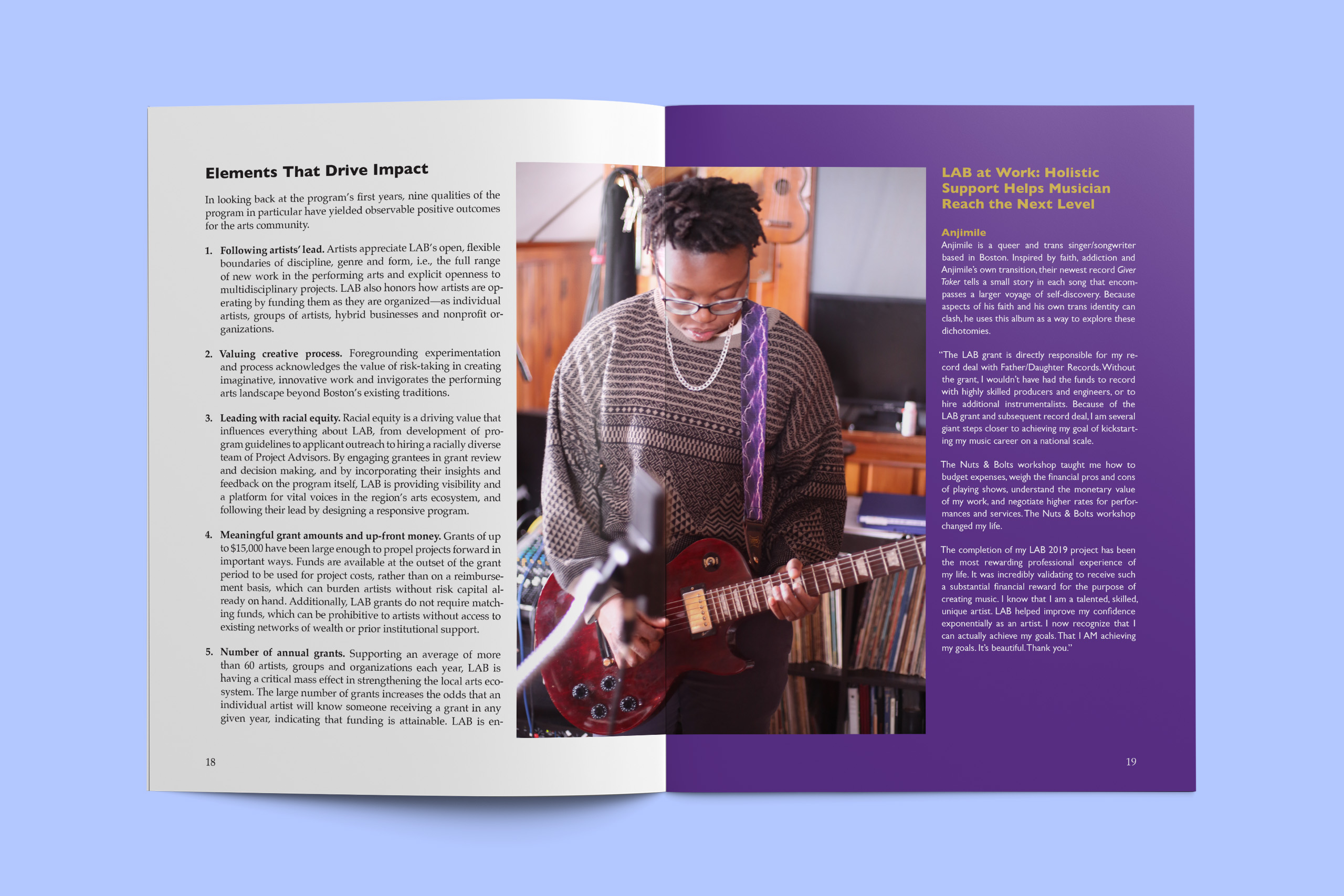
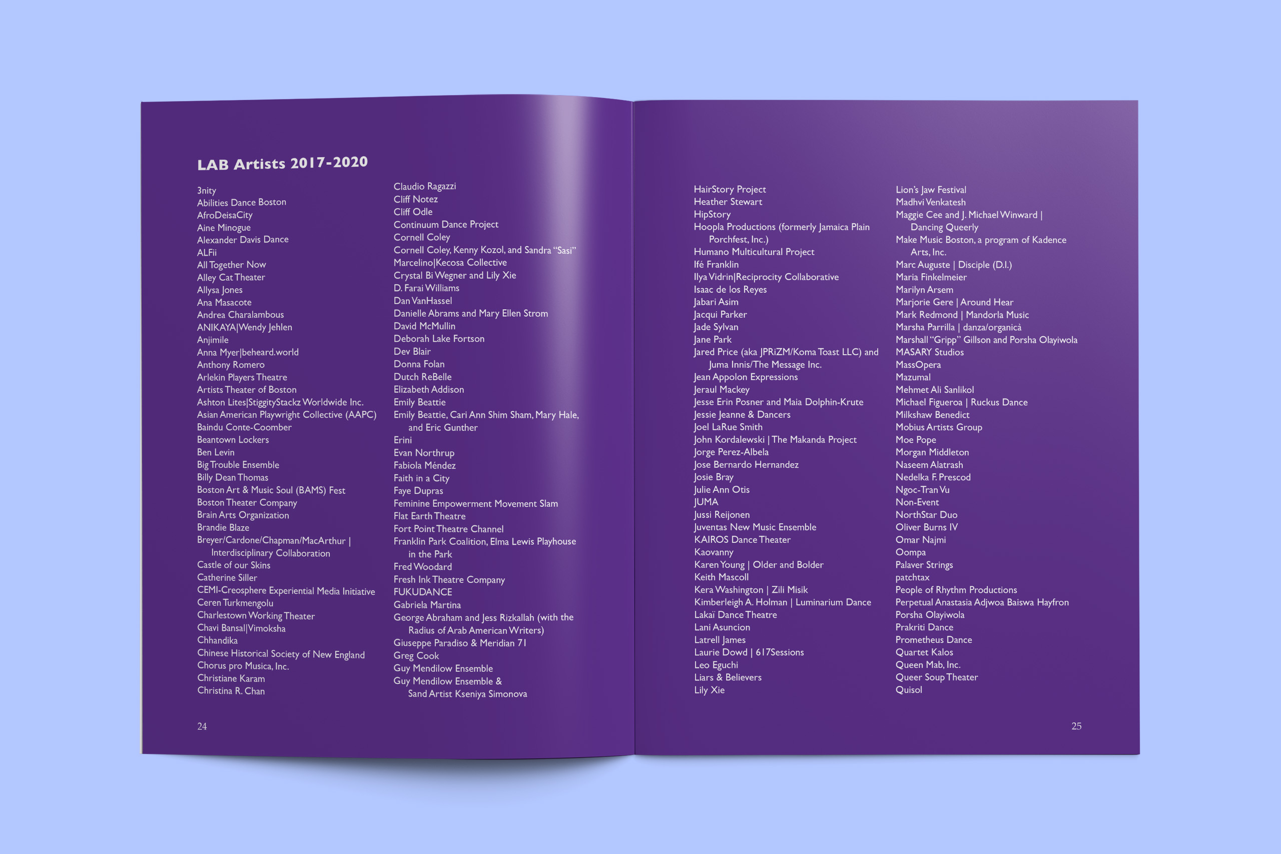
The Boston Foundation: Celebrating Live Arts Boston's First Three Years
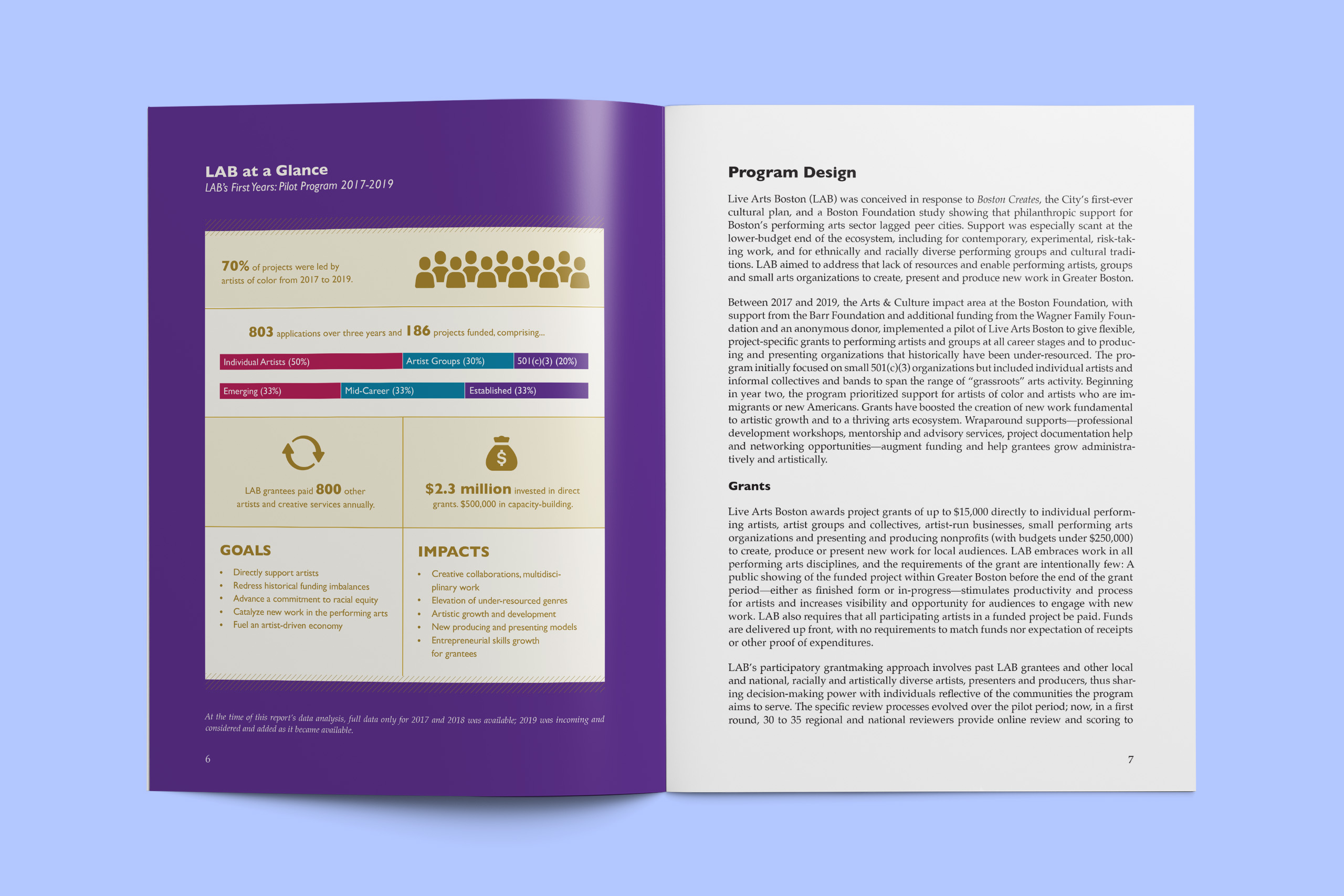
In 2016, the Boston Foundation commissioned a study that found major grants and philanthropic support for the creative arts in Greater Boston often went to a few large institutions, leaving fewer financial resources for smaller organizations, groups, and individual artists to ideate and produce art. To address this disparity and help the City of Boston develop a thriving, diverse arts community, the Boston Foundation created the Live Arts Boston grant program in partnership with the Barr Foundation. This program provides artists with flexible financial support and coaching to experiment and produce creative work.
I worked closely with the Live Arts Boston grant program and communications teams to design a 3-year retrospective report and translate it into an engaging online content hub.
Role:
Visual and Print Design
Timeline:
~2 months (08/2020–10/2020)
Core Responsibilities:
Wireframing, Print Design, and Visual Design
Goals
This project aimed to share insights into how the Boston Foundation and its partners ran the program so that other similar initiatives could learn from it.
- Amplify grantees' experiences, leveraging written and video testimonies from Live Arts Boston grant recipients.
- Demonstrate how the program advances equity within Boston's arts and culture community.
- Highlight quantitative and qualitative learnings from the program's development and execution.
Content Hub
To start this project, I met with the team to discuss the report content and some initial intentions for the user's experience. Ideally, we wanted the webpage to be visual, preview the downloadable print report, and encourage audiences to download the full report.
I was responsible for designing the wireframes, and the internal web lead would use the wireframes as a reference when building the actual page using their CMS. When developing the wireframes, I utilized site features, such as accordions and multiple-column layouts, because this functionality already existed within the site and would allow for a frictionless experience for web users. Minimizing the need to develop new features allowed us to build the page within our timeline and avoid disruptions in the site experience. Since the website had a clear look and feel and some brand assets were available, I produced higher-fidelity wireframes for the team to review, giving them a close-to-real look at how the designs would appear.
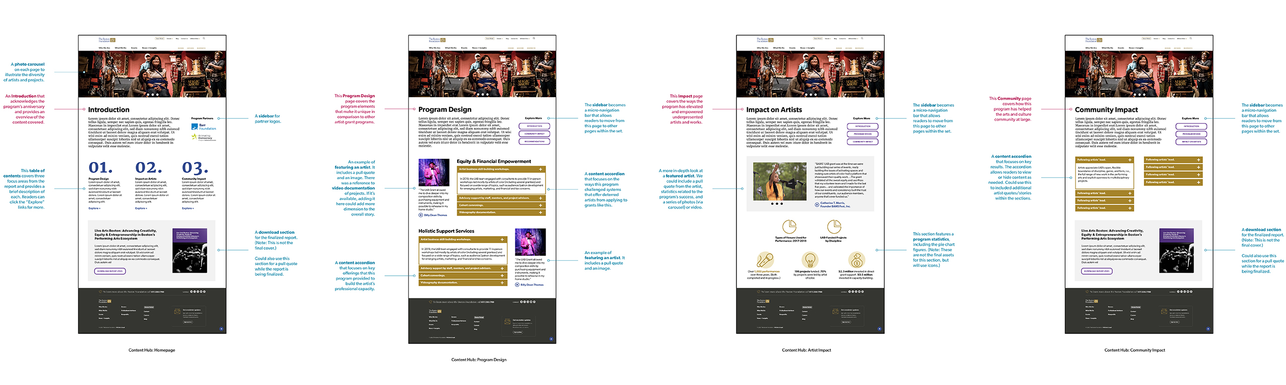
The initial high-fidelity mockups featured a multi-page content hub experience
The initial high-fidelity mockups I created featured a series of linked web pages. The benefit is that we could share a greater mix of content and control the pace of the information's delivery. The introduction page served as a table of contents for users, allowing them to click on specific pages highlighting the needed information. Each page had a sidebar menu next to the Introduction, allowing them to navigate between pages as desired. Carousels would have enabled us to share artist testimonies in multiple formats (photography, video, and text), providing visual interest and storytelling.
When I presented the mockups to the team, I also included annotations within the design. I knew the team would share and review these with other stakeholders outside of our meetings, and the notes provide context for specific interactions and page functionality.
Quickly, we realized the multi-page approach created a complex user experience, requiring a lot of effort from the audience to navigate multiple pages. So, for the following iterations, I focused on a smaller set of narrative points for the general public, prioritizing artist stories, key program data, and the full report, which I was also designing at this time as well.
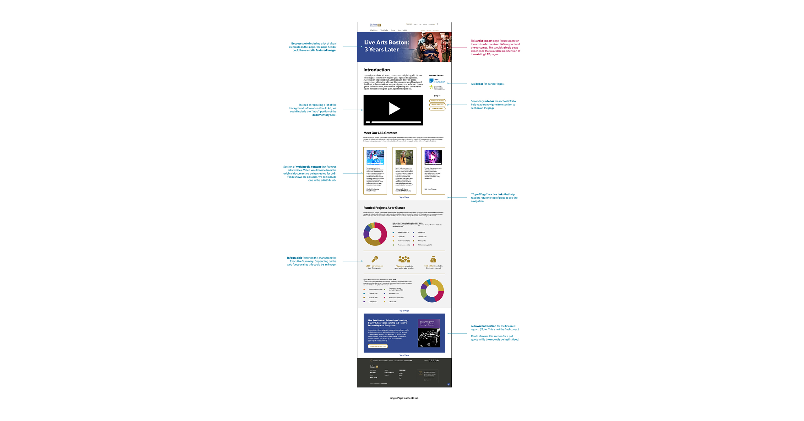
The second draft of the high-fidelity mockup featured a single-page content hub experience
When designing the second draft, I worked to simplify the page's functionality, removing elements like the accordion and carousels and minimizing mixing column layouts within the page. The intention was to make the content immediately visible, avoiding features that hide content and design approaches that would cause the audience to relearn how to navigate the page within a single experience.
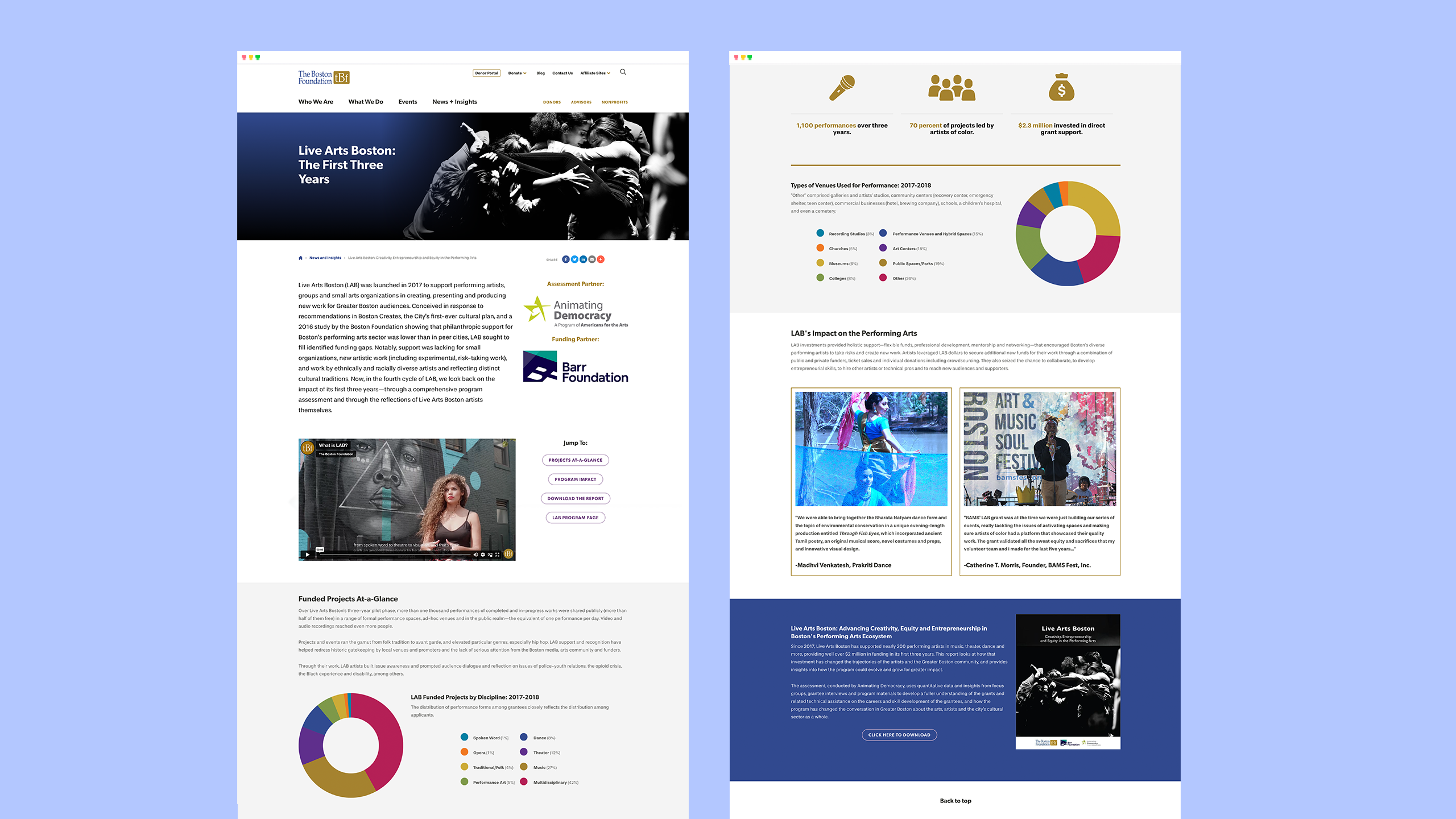
The final content hub layout (split into two screens)
Anniversary Publication
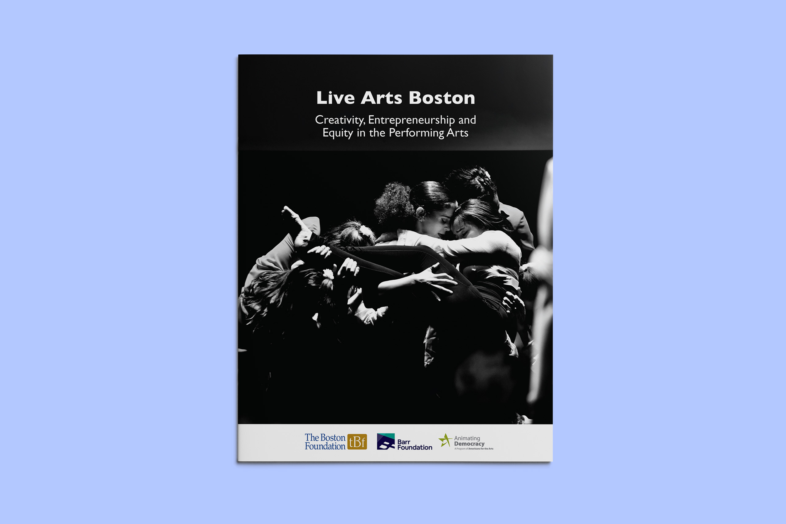
One of the key functions of the content hub is to allow visitors to download the full grant report. The Boston Foundation has such a strong institutional brand, which factored in heavily to the overall design of the publication. In the same spirit of the content hub, I developed layouts that would show artists' stories prominently and make room for numerous testimonials.
Selected Works

You Got Mail: Package Design for Influencer KitsProject type
Gender Justice Video ProjectVideo, Storytelling
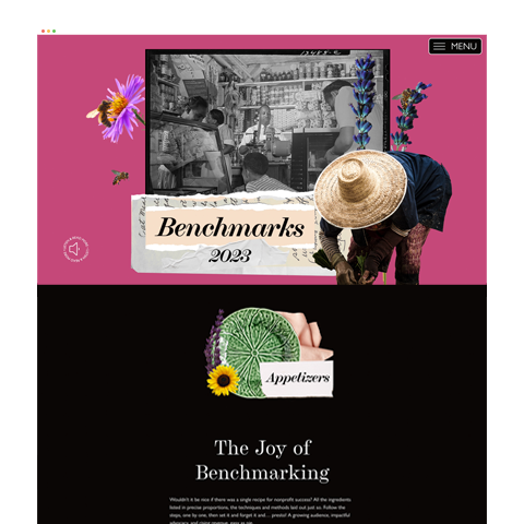
M+R Benchmarks Study 2023Project type

National Mentoring Summit 2021Storytelling, Content Development

Celebrating Live Arts Boston's First Three YearsAs a visual design consultant for the Boston Foundation, I worked with their team to produce a story-driven content hub and retrospective print report to highlight the grant's impact on advancing diversity, equity, and inclusion within the Greater Boston art scene.
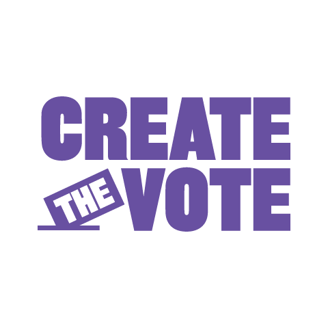
Create the VoteProject type
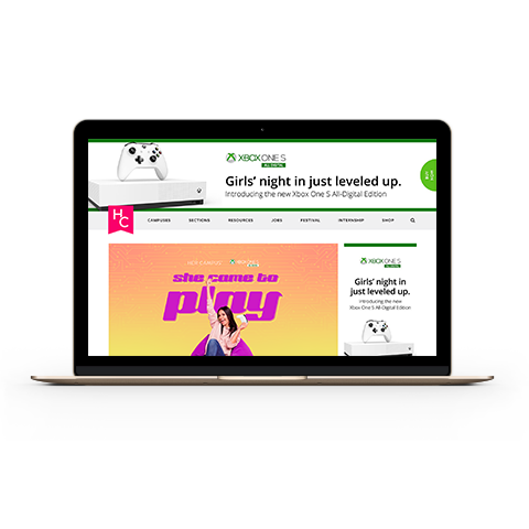
She Came to PlayProject type
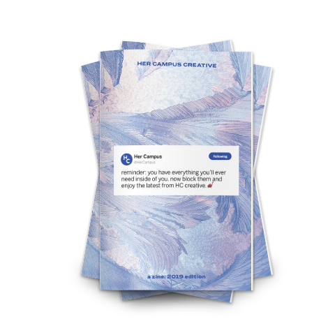
Her Campus Creative ZineProject type

Refresh Your Day TourProject type
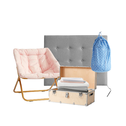
Dorm Sweet DormProject type

Youth VoteProject type

Power of Good TourProject type

Storied EatsProject type
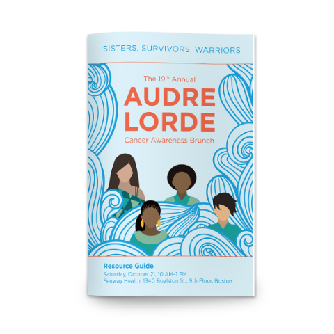
Breast Cancer AwarenessProject type

Boomerangs Thrift Store RebrandProject type

Public Policy x LGBTQ+ Health OutcomesProject type
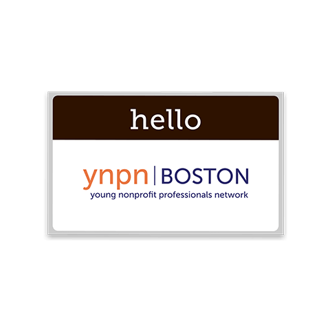
YNPN Boston: Brand DesignProject type

Public Health InfographicsProject type